Sometimes you just want a quick way to explore real data with a small team: a few KPI cards, a couple of charts, and a table you can filter without opening Excel for the 14th time today. You don’t need a full BI suite or a new framework – you just need a tiny, honest dashboard you can understand end to end.
This project shows how to build exactly that: a minimal Flask + Pandas dashboard that turns a CSV file into an interactive web UI, then lets you swap datasets and reconfigure metrics in minutes. By the end, you’ll know how to clone the repo, run it locally, plug in your own data, and ship a small dashboard that feels surprisingly “production-flavoured”.
What this small Flask dashboard gives you out of the box
The repo is intentionally simple: there’s no Plotly, no Streamlit, and no front-end framework. Instead, you get a clear chain from data to pixels:
- CSV in – a single input file loaded with Pandas.
- Config-driven KPIs – cards defined in
config/dashboard.yml, not hard-coded Python. - JSON API – Flask routes expose metrics and chart data as JSON.
- Vanilla JS + SVG – charts rendered directly in the browser, so you can see exactly how they work.
- Neat, responsive UI – a clean layout that feels like a real product, not a throwaway demo.
Because the dashboard is controlled by a YAML config and a CSV path, you can point it at a different dataset (for example, marketing performance instead of sales data) and get a new view without rewriting the backend.
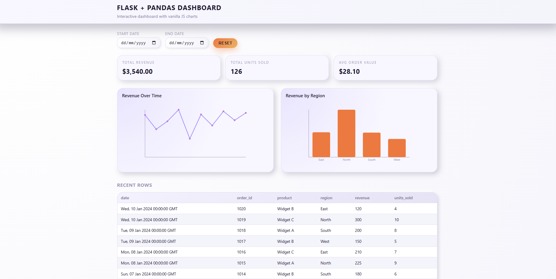
The complete project used in this walkthrough lives here:
https://github.com/dorian-sotpyrc/create-an-interactive-data-dashboard-with-python
Clone it and follow along with the steps below on your own machine.
Run your first dashboard in a few shell commands
Let’s start from zero and get the default dashboard running locally. You only need Python, Git, and a terminal.
-
Clone the repo and create a virtual environment
From a working folder, clone the project and create a fresh environment so you don’t pollute your global Python install:
BASHgit clone https://github.com/dorian-sotpyrc/create-an-interactive-data-dashboard-with-python.git cd create-an-interactive-data-dashboard-with-python python -m venv .venv source .venv/bin/activate # On Windows: .venv\Scripts\activate -
Install dependencies and start Flask
Install the minimal dependency set, then run the app entrypoint:
BASHpip install -r requirements.txt python app.pyBy default the server binds to
0.0.0.0:8509, so you can visithttp://127.0.0.1:8509in your browser. You should see KPI cards, a couple of charts, and a “Recent rows” table backed by the sample dataset. -
Click around and watch the API in action
Open your browser’s network tab: as you change the date filters, you’ll see calls to
/api/metrics,/api/charts/<chart_id>, and/api/table. These endpoints are driven entirely by the YAML config, not hard-coded for a single project.
Once a question crops up more than a couple of times, it deserves a small dashboard. A lightweight Flask app like this gives you a single, repeatable view of the truth instead of half a dozen “final_v3.xlsx” files floating around.
Swap in your own CSV without touching the backend
The dashboard doesn’t care what your data represents – sales, marketing, lab measurements, IoT telemetry – as long as it’s tabular and has a date column. To plug in a new dataset, you update two things:
- The CSV file itself, stored under
data/. - The
data_sourceand metric/chart definitions inconfig/dashboard.yml.
For example, the repo now ships with a small marketing performance dataset:
data/marketing_campaign_performance.csv

date,campaign,channel,spend,clicks,signups,revenue
2025-01-01,Launch A,Search,420,950,120,3100
2025-01-01,Launch A,Social,260,780,90,2100
...
To make the dashboard use this data instead of the original sales sample, point data_source at the new file and ensure date_column reflects your date field:
# config/dashboard.yml

data_source: data/marketing_campaign_performance.csv
date_column: date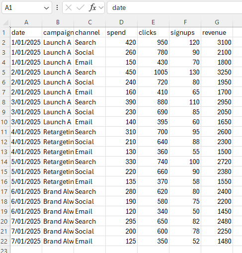
config/dashboard.yml to point at the new source.
Define KPI cards and charts with a few YAML lines
Once your data is wired in, you decide what to show on the dashboard. The project treats metrics and charts as configuration, not code, which keeps the Flask layer small and predictable.
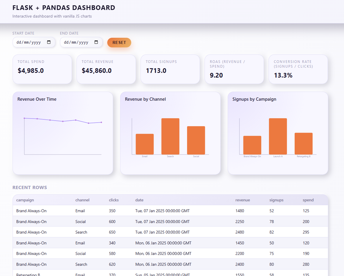
For example, here’s the marketing metrics section for total spend, revenue, signups, and two ratios:
metrics:
  - id: total_spend
    label: Total Spend
    column: spend
    aggregation: sum
    format: "$,.2f"

  - id: total_revenue
    label: Total Revenue
    column: revenue
    aggregation: sum
    format: "$,.2f"

  - id: total_signups
    label: Total Signups
    column: signups
    aggregation: sum
    format: "0.0"

  - id: roas
    label: ROAS (Revenue / Spend)
    numerator: revenue
    denominator: spend
    aggregation: ratio
    format: "0.00"

  - id: conversion_rate
    label: Conversion Rate (Signups / Clicks)
    numerator: signups
    denominator: clicks
    aggregation: ratio
    format: "0.0%"
Each metric declares:
- Which column(s) to aggregate.
- How to aggregate (sum, mean, ratio, etc.).
- How to format the result for display.
Charts follow the same pattern. Here’s the block that defines revenue and spend over time, plus breakdowns by channel and campaign:
charts:
  - id: revenue_over_time
    label: Revenue Over Time
    type: line
    x: date
    y: revenue
    aggregation: sum

  - id: spend_over_time
    label: Spend Over Time
    type: line
    x: date
    y: spend
    aggregation: sum

  - id: revenue_by_channel
    label: Revenue by Channel
    type: bar
    x: channel
    y: revenue
    aggregation: sum

  - id: signups_by_campaign
    label: Signups by Campaign
    type: bar
    x: campaign
    y: signups
    aggregation: sum
When you restart the app, the frontend reads this config, requests chart data from Flask, and draws SVG visuals in a consistent PLEX style. To add a new chart later – for example, click-through rate by campaign – you just add another block to charts.
Understand the JSON API powering the browser
The reason this dashboard is easy to extend is that everything flows through a small JSON API. Three endpoints do most of the work:
/api/metrics– runs aggregations defined inmetricsand returns card values./api/charts/<chart_id>– returns a simple{ id, label, type, points }payload for each chart./api/table– returns up to 50 recent rows for a quick “what’s really in this dataset?” view.
Filters like start_date and end_date are passed as query parameters, then applied in Pandas via a small helper in app/data.py. Because the response shapes are stable, the front-end code in static/js/dashboard.js barely changes as you add new metrics and charts.
Deploy the dashboard so your team can explore data together
Once you’re happy with the layout and metrics, you can promote this from a local experiment to a shared internal tool. The repo includes a Dockerfile and a Gunicorn command so you can host it alongside other PLEX-style tools.
# Run with Gunicorn
gunicorn "app:create_app()" --bind 0.0.0.0:8000
On a small VPS or internal server, that’s enough to give your team a stable URL where they can slice the data, change date ranges, and discuss results using the same source of truth.
Where to take this dashboard pattern next
The version in this repo is deliberately small. It’s meant to be copied, forked, and modified, not treated as a sealed product. From here you can:
- Point it at a live database instead of a static CSV.
- Add authentication so only your team can see sensitive metrics.
- Introduce more advanced charts (stacked bars, rolling averages) while keeping the JSON contract simple.
- Turn it into a template for all your “quick question” dashboards so you never start from a blank Flask app again.
Most importantly, you now have a pattern: data → config → JSON API → lightweight UI. That’s a foundation you can re-use across projects, whether you’re building internal tools at work or experimenting on your own time.
Related PLEX reading
References & further reading
-
Flask documentation
Official documentation for the microframework that powers the dashboard’s routing and JSON API. -
Pandas user guide
Deep dive into the DataFrame operations you’ll use to aggregate metrics and prepare chart data. -
MDN SVG tutorial
A practical introduction to drawing lines, shapes, and text with SVG – exactly what this dashboard’s charts rely on. -
YAML specification and overview
Background on the configuration format used byconfig/dashboard.ymlto describe metrics and charts. -
The Twelve-Factor App
A set of principles for packaging and deploying small services; useful when you start running this dashboard in production-like environments.