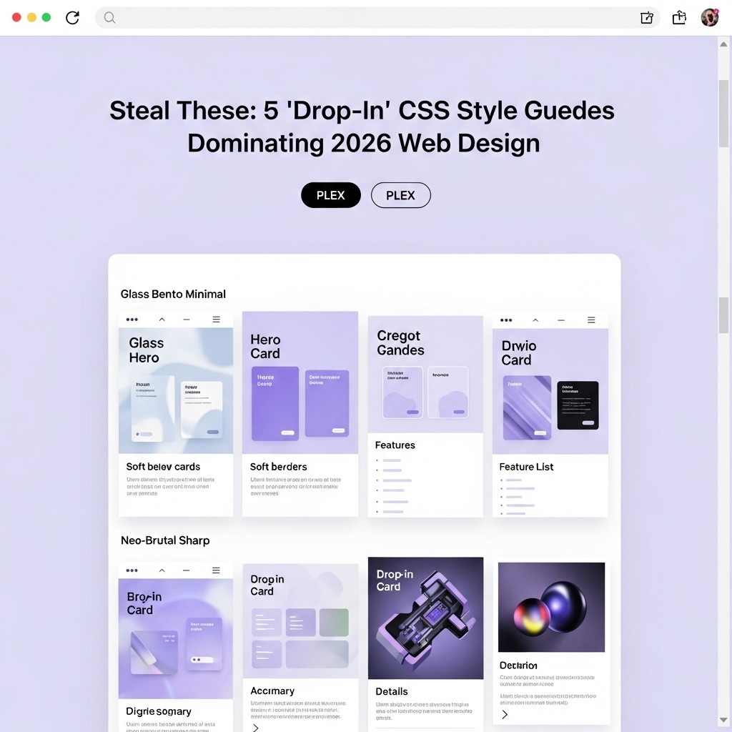
Five paste-ready micro style guides. Each includes tokens + a tiny component set (card, button, input) and a matching visual preview. Pick one, ship today, iterate later.
No trend essay. Just five drop-in CSS micro style guides that are dominating what “modern UI” looks like in 2026.
Each guide is intentionally small: :root tokens + body + .card + .btn + input.
And because code dumps are useless without context, every style includes a visual preview so you can pick fast.
Download the starter HTML (works with all 5)
Want the fastest way to try these? Use the same demo HTML for every style and just swap the CSS snippet.
Download drop-in-css-style-guides-starter.html
Create the file at static/downloads/drop-in-css-style-guides-starter.html so this link resolves.
Quick start (swap styles in under 60 seconds)
- Download the starter HTML file above and open it in a code editor.
- Find the
<style id="theme">block that saysPASTE STYLE GUIDE HERE. - Copy one style guide snippet from this article and paste it into that block.
- Save and open the file in your browser. To switch styles, replace the CSS with a different snippet.
The rule
Pick one. Don’t mix. Paste it, ship a page, then iterate by tuning tokens (brand color, radius, shadow, focus ring). That’s how “2026 design” actually gets built.
Why “Drop‑In” Style Guides Are Dominating 2026
2026 design isn’t about inventing a new vibe — it’s about shipping consistent systems fast. Teams are standardising on tiny “micro style guides” because they’re:
- Token-first (color/space/radius/shadow live in one place)
- Composable (cards/buttons/inputs share the same primitives)
- Portable (one file you can drop into a new page and immediately see “the look”)
- Auditable (small enough to read, tweak, and keep coherent)
Rule: pick one guide per page. Mixing two “systems” is how UIs get weird.
Copy‑Paste in 60 Seconds: How to Use These Drop‑In CSS Style Guides
Paste the snippet, then apply the classes. If your markup already has .card and .btn,
you’re basically done. If not, add them once and reuse forever.
1) Glass Bento Minimal — Drop‑In CSS Style Guide (Frosted Cards + Bento Grid)
Use when you want “premium” fast: frosted panels, soft blur, thin strokes, periwinkle glow.
Quick swap: paste the snippet below into <style id="theme"> in the starter HTML, save, refresh.
One style guide. Instant design system.
Tokens + cards + buttons + inputs. Ship today, iterate tomorrow.
:root {
  --bg:#0b0f1a;
  --panel:rgba(255,255,255,.06);
  --stroke:rgba(255,255,255,.12);
  --text:rgba(255,255,255,.92);
  --muted:rgba(255,255,255,.72);
  --r:18px;
  --pad:18px;
  --shadow:0 18px 60px rgba(0,0,0,.45);
  --ring:0 0 0 3px rgba(143,183,255,.28);
}

body {
  margin:0;
  font:16px/1.5 system-ui;
  background:radial-gradient(1200px 800px at 20% 10%,rgba(143,183,255,.18),transparent 60%),var(--bg);
  color:var(--text);
}

.card {
  background:var(--panel);
  border:1px solid var(--stroke);
  border-radius:var(--r);
  padding:var(--pad);
  box-shadow:var(--shadow);
  backdrop-filter: blur(14px);
}

.btn {
  display:inline-flex;
  align-items:center;
  gap:.6rem;
  padding:.7rem 1rem;
  border-radius:999px;
  border:1px solid var(--stroke);
  background:rgba(255,255,255,.08);
  color:var(--text);
  text-decoration:none;
}

.btn:hover {
  background:rgba(255,255,255,.12);
}

input {
  border:1px solid rgba(255,255,255,.16);
  background:rgba(255,255,255,.06);
  color:var(--text);
  border-radius:14px;
  padding:.7rem .8rem;
  outline:none;
}

.btn:focus-visible,input:focus {
  box-shadow:var(--ring);
}
2) Neo‑Brutal Sharp — Drop‑In CSS Style Guide (Hard Borders + Offset Shadows)
Use when you want bold + obvious: hard edges, thick outlines, offset shadows. PLEX accents only.
Quick swap: paste the snippet below into <style id="theme"> in the starter HTML, save, refresh.
One style guide. Instant design system.
Tokens + cards + buttons + inputs. Ship today, iterate tomorrow.
:root {
  --bg:#f4f2ff;
  --ink:#14161e;
  --lav:#b9b7ff;
  --r:12px;
  --shadow:6px 6px 0 var(--ink);
  --ring:0 0 0 3px rgba(185,183,255,.55);
}

body {
  margin:0;
  font:16px/1.5 system-ui;
  background:var(--bg);
  color:var(--ink);
}

.card {
  background:#fff;
  border:2px solid var(--ink);
  border-radius:var(--r);
  padding:18px;
  box-shadow:var(--shadow);
}

.btn {
  display:inline-flex;
  align-items:center;
  gap:.6rem;
  padding:.75rem 1rem;
  border:2px solid var(--ink);
  border-radius:var(--r);
  background:var(--lav);
  color:var(--ink);
  text-decoration:none;
  box-shadow:var(--shadow);
}

.btn.secondary {
  background:#fff;
}

.btn:active {
  transform:translate(3px,3px);
  box-shadow:3px 3px 0 var(--ink);
}

input {
  border:2px solid var(--ink);
  border-radius:var(--r);
  padding:.7rem .8rem;
  outline:none;
  box-shadow:var(--shadow);
}

.btn:focus-visible,input:focus {
  box-shadow:var(--ring), var(--shadow);
}
3) Soft Editorial Neumorph — Drop‑In CSS Style Guide (Neumorphic Cards + Calm Gradients)
Use when you want calm “tool UI”: plush depth, soft shadows, muted lavender gradients.
Quick swap: paste the snippet below into <style id="theme"> in the starter HTML, save, refresh.
One style guide. Instant design system.
Tokens + cards + buttons + inputs. Ship today, iterate tomorrow.
:root {
  --bg:#eef1ff;
  --panel:#f6f7ff;
  --text:#1b1e2a;
  --r:22px;
  --hi:rgba(255,255,255,.9);
  --lo:rgba(30,35,60,.12);
  --ring:0 0 0 3px rgba(143,183,255,.25);
}

body {
  margin:0;
  font:16px/1.6 system-ui;
  background:linear-gradient(180deg,#f3f5ff,var(--bg));
  color:var(--text);
}

.card {
  background:var(--panel);
  border-radius:var(--r);
  padding:18px;
  box-shadow:10px 10px 28px var(--lo), -10px -10px 24px var(--hi);
}

.btn {
  display:inline-flex;
  align-items:center;
  gap:.6rem;
  padding:.7rem 1rem;
  border-radius:999px;
  background:var(--panel);
  color:var(--text);
  text-decoration:none;
  box-shadow:8px 8px 20px var(--lo), -8px -8px 18px var(--hi);
}

input {
  border:none;
  background:var(--panel);
  border-radius:14px;
  padding:.7rem .8rem;
  outline:none;
  box-shadow:inset 6px 6px 14px rgba(30,35,60,.10), inset -6px -6px 14px rgba(255,255,255,.85);
}

.btn:focus-visible,input:focus {
  box-shadow:var(--ring), 8px 8px 20px var(--lo), -8px -8px 18px var(--hi);
}
4) Type‑First Monochrome — Drop‑In CSS Style Guide (Strict Grid + Minimal UI)
Use when typography is the design: strict grid, minimal accents, editorial hierarchy.
Quick swap: paste the snippet below into <style id="theme"> in the starter HTML, save, refresh.
One style guide. Instant design system.
Tokens + cards + buttons + inputs. Ship today, iterate tomorrow.
:root {
  --bg:#0a0a0c;
  --text:#f4f4f5;
  --muted:#a1a1aa;
  --line:#2a2a32;
  --r:16px;
  --ring:0 0 0 3px rgba(185,183,255,.22);
}

body {
  margin:0;
  font:16px/1.7 ui-serif, Georgia, serif;
  background:var(--bg);
  color:var(--text);
}

h1,h2 {
  letter-spacing:-.02em;
  line-height:1.1;
  font-family:ui-sans-serif,system-ui;
}

.card {
  border:1px solid var(--line);
  border-radius:var(--r);
  padding:18px;
  background:rgba(255,255,255,.03);
}

.btn {
  display:inline-flex;
  align-items:center;
  gap:.6rem;
  padding:.7rem 1rem;
  border-radius:999px;
  border:1px solid var(--line);
  background:transparent;
  color:var(--text);
  text-decoration:none;
}

.btn:hover {
  background:rgba(255,255,255,.06);
}

input {
  border:1px solid var(--line);
  background:rgba(255,255,255,.03);
  color:var(--text);
  border-radius:14px;
  padding:.7rem .8rem;
  outline:none;
}

.btn:focus-visible,input:focus {
  box-shadow:var(--ring);
}
5) Motion‑Polished Micro‑Interactions — Drop‑In CSS Style Guide (Hover Lift + Focus Rings)
Use when you want “app polish”: subtle lift, micro highlight rings, motion-respectful defaults.
Quick swap: paste the snippet below into <style id="theme"> in the starter HTML, save, refresh.
One style guide. Instant design system.
Tokens + cards + buttons + inputs. Ship today, iterate tomorrow.
:root {
  --bg:#0b1220;
  --panel:#0f1a2e;
  --text:#eaf0ff;
  --stroke:rgba(255,255,255,.10);
  --r:18px;
  --t:180ms cubic-bezier(.2,.8,.2,1);
  --ring:0 0 0 3px rgba(143,183,255,.22);
}

body {
  margin:0;
  font:16px/1.5 system-ui;
  background:var(--bg);
  color:var(--text);
}

.card {
  background:var(--panel);
  border:1px solid var(--stroke);
  border-radius:var(--r);
  padding:18px;
  transition:transform var(--t), box-shadow var(--t);
}

.card:hover {
  transform:translateY(-4px);
  box-shadow:0 18px 60px rgba(0,0,0,.45);
}

.btn {
  display:inline-flex;
  align-items:center;
  gap:.6rem;
  padding:.7rem 1rem;
  border-radius:999px;
  border:1px solid var(--stroke);
  background:transparent;
  color:var(--text);
  text-decoration:none;
  transition:transform var(--t), background var(--t), box-shadow var(--t);
}

.btn:hover {
  background:rgba(255,255,255,.06);
  transform:translateY(-1px);
}

.btn:focus-visible {
  box-shadow:var(--ring);
}

input {
  border:1px solid var(--stroke);
  background:rgba(255,255,255,.04);
  color:var(--text);
  border-radius:14px;
  padding:.7rem .8rem;
  outline:none;
}

input:focus {
  box-shadow:var(--ring);
}

@media (prefers-reduced-motion: reduce) {
  * {
    transition:none!important;
  }
}
Pick One Guide. Don’t Mix Systems. Ship.
If you want these to match your brand, only touch the tokens: brand color, radius, shadow, focus ring. Everything else stays stable — that’s the whole point of a drop-in style guide.
Related PLEX Reading
If you’re building a small design system (or just want your UI to stay coherent as it grows), these pair well with this post: